Experimental Typographic Exploration
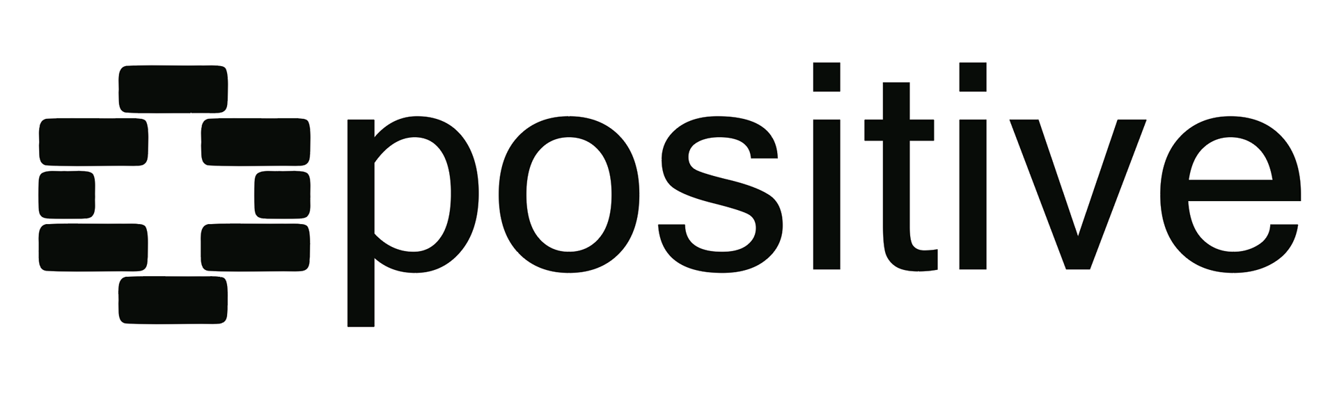
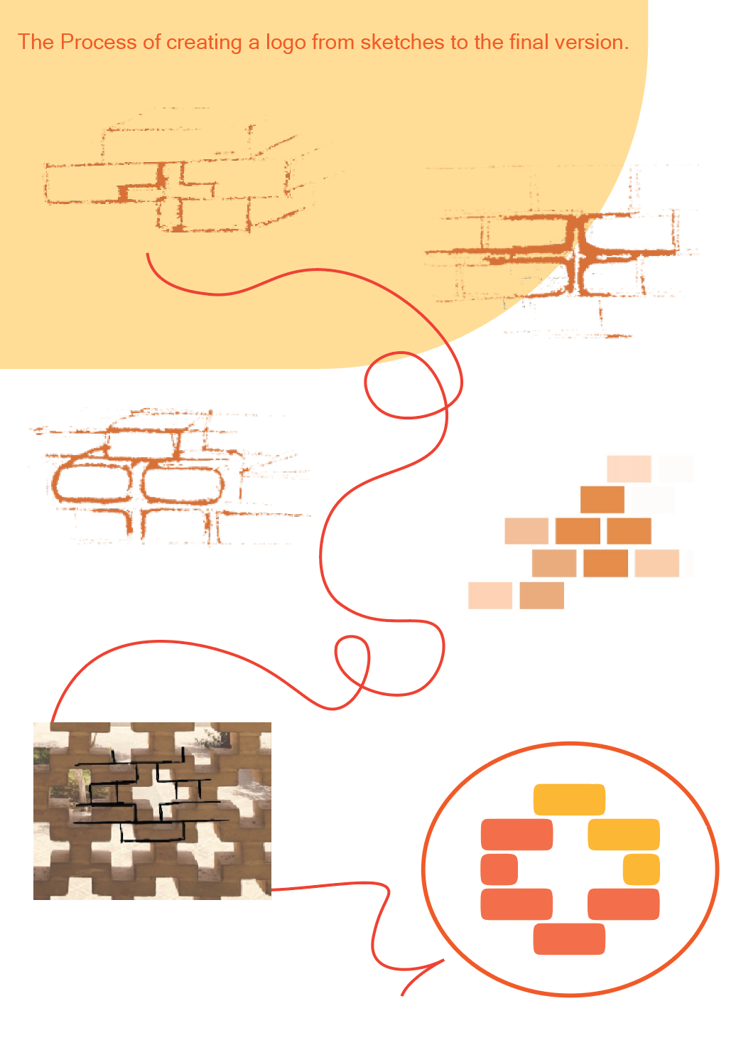
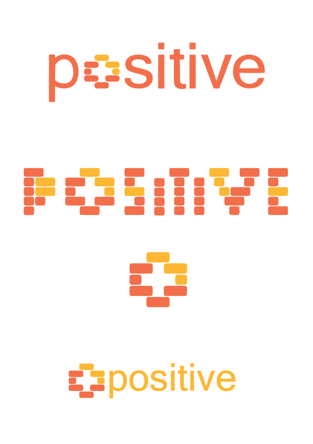
Positive Brick is a conceptual typographic logo inspired by modular brick structures. Each letter is constructed from individual blocks to represent growth, positivity, and the idea of building step by step. The project explores how typography can transform into a visual system, extending beyond a logo into patterns and brand identity elements.
Each letter of the alphabet, as it is designed, can be used for and be useful in the following cases:
Brand system
Pattern
Poster typography
And the final outcome focuses on balancing expressiveness and readability by refining the typographic hierarchy
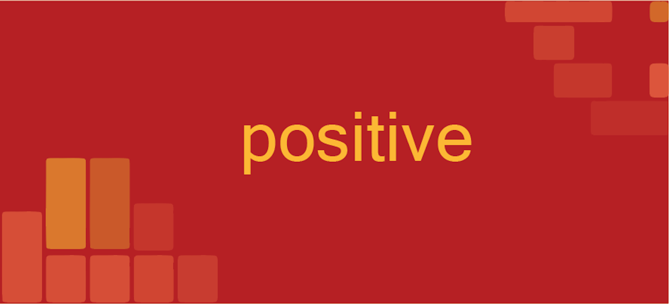
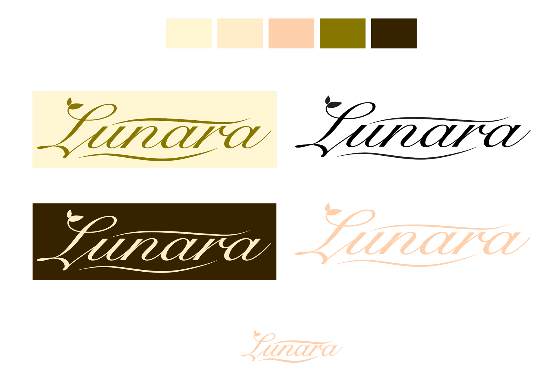
The color palette features beige, cream, burnt brown and olive green, carefully selected to evoke a sense of calmness, warmth, and understated luxury. A deep chocolate brown is introduced as a complementary accent color to create contrast and improve visual balance across various applications.
Logo Concept Statement
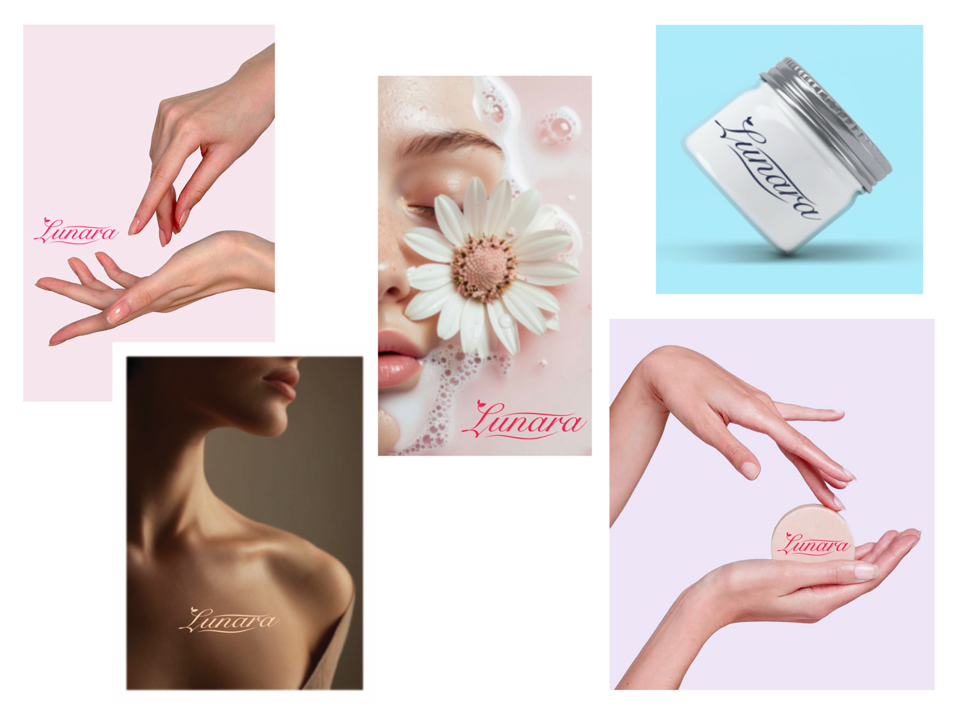
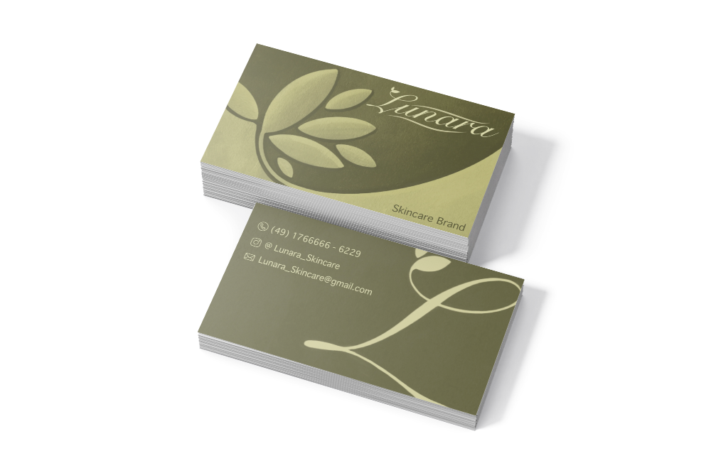
The Lunara logo is designed to convey feminine elegance, refined luxury, and a strong connection to nature. A soft, flowing script typeface is used to express delicacy and beauty, while the elongated letterforms subtly enhance the sense of sophistication and premium quality.
A leaf element is incorporated into the design to symbolize natural beauty, purity, and organic values, reinforcing the brand's connection to nature-inspired cosmetics.
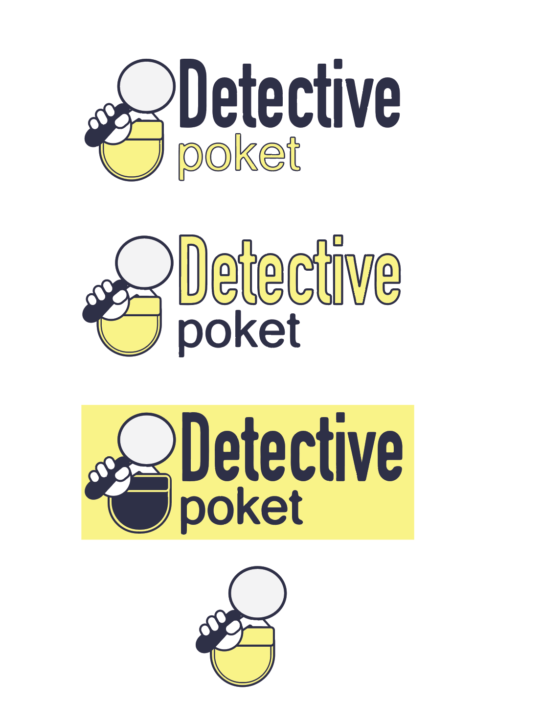
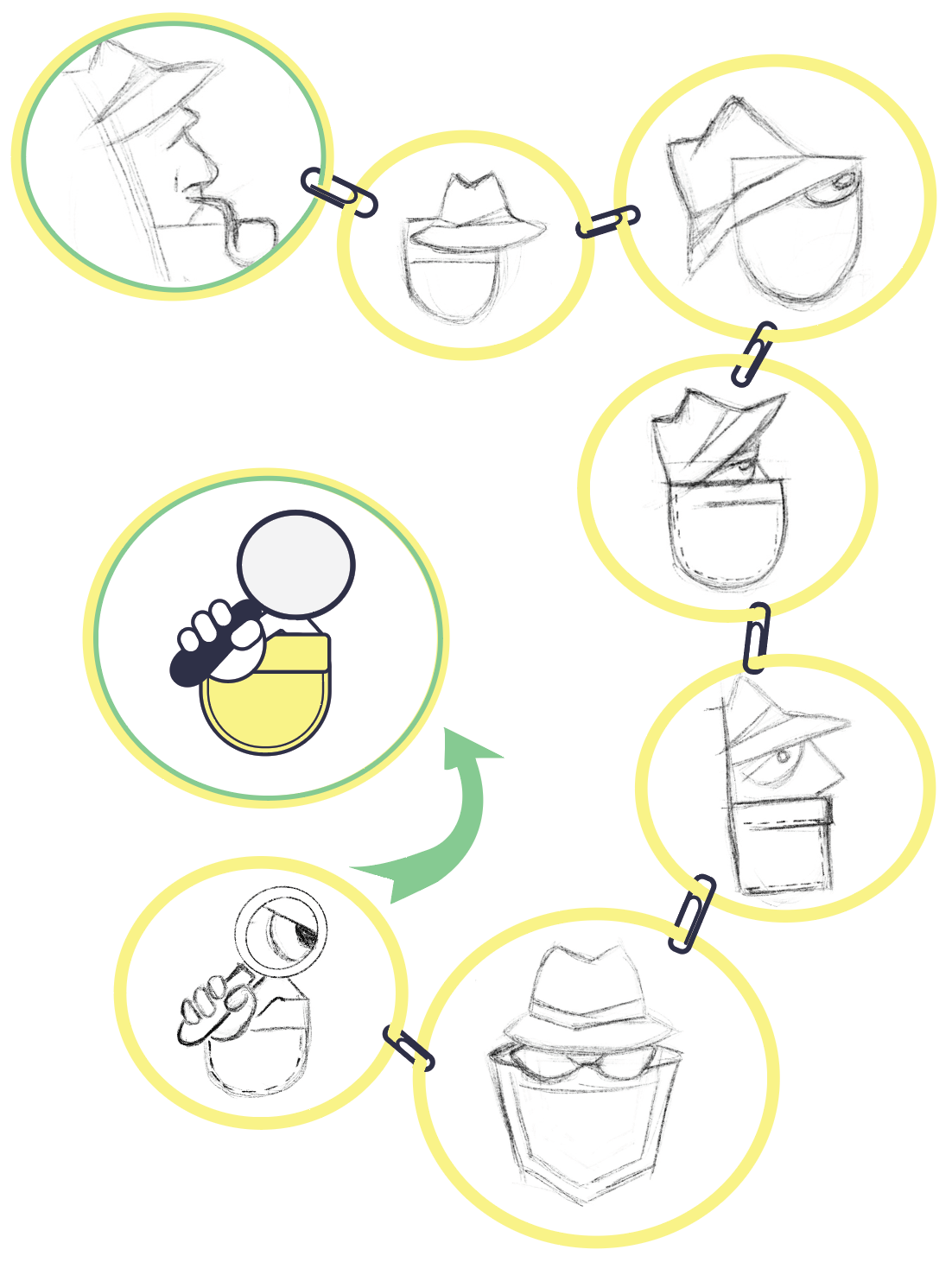
The Detective Poket logo combines a magnifying glass with a pocket, creating a clear and playful symbol of curiosity, exploration, and discovery. This makes it ideal for apps, educational tools, and child-friendly products. The standalone icon is strong and versatile, especially in small sizes.
Color Choice:
The primary yellow evokes curiosity, energy, and attention, reinforcing the detective theme and making the logo eye-catching.
Typography:
Clean and approachable, supporting the icon without overpowering it, though some versions show minor inconsistencies in line thickness.
Color Choice:
The primary yellow evokes curiosity, energy, and attention, reinforcing the detective theme and making the logo eye-catching.
Typography:
Clean and approachable, supporting the icon without overpowering it, though some versions show minor inconsistencies in line thickness.
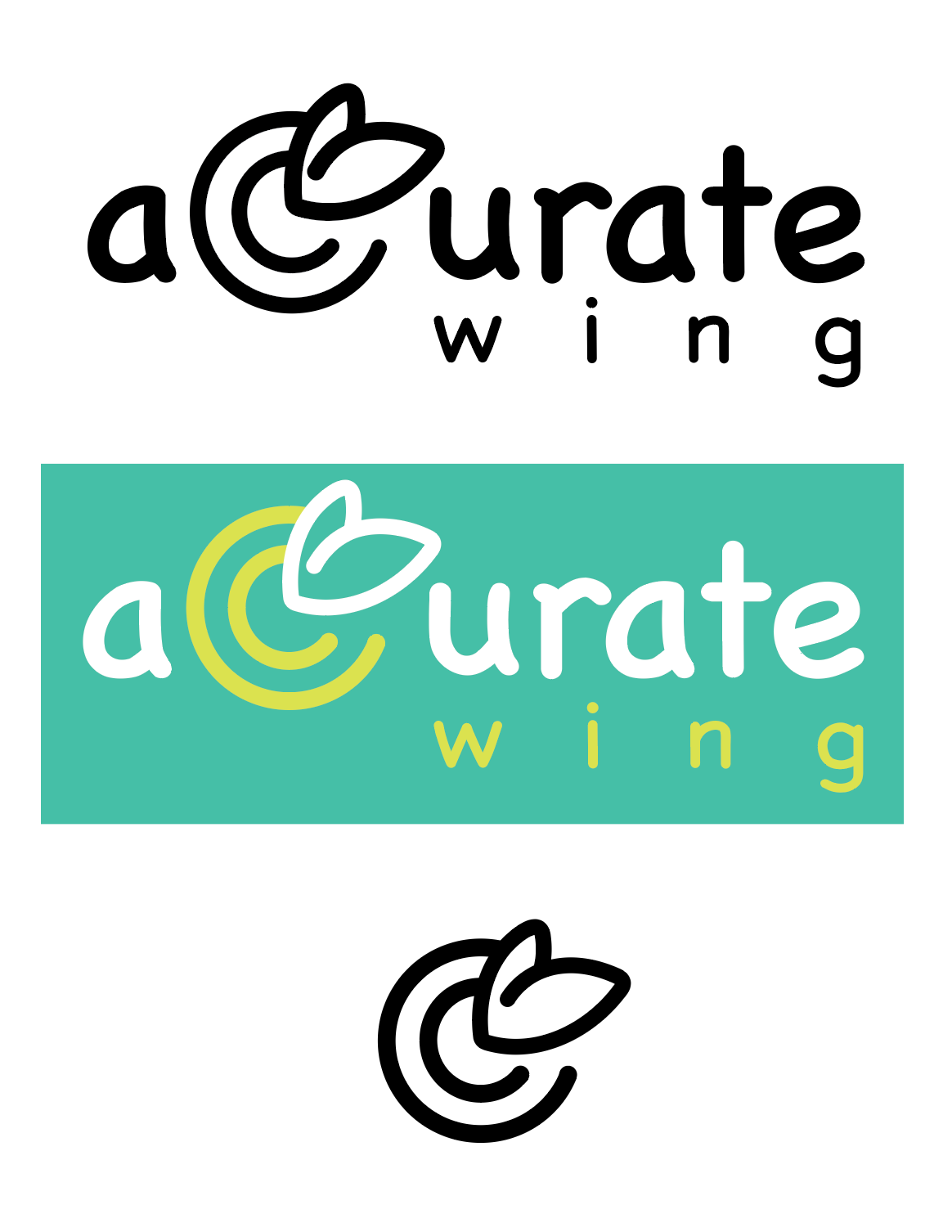
Logo Analysis – Accurate Wing
The Accurate Wing logo demonstrates a sophisticated balance of concept, aesthetics, and functionality. Its design reflects precision, growth, and a natural ethos, making it both visually appealing and conceptually strong.
The Accurate Wing logo demonstrates a sophisticated balance of concept, aesthetics, and functionality. Its design reflects precision, growth, and a natural ethos, making it both visually appealing and conceptually strong.